





























































When should you break the rule of thirds?
The rule of thirds is a good starting point, but it doesn't suit every frame. I walk through examples where central composition, symmetry and negative space are stronger.
The rule of thirds is one of the first rules almost everyone learns when they start out in photography. These lines, which divide the frame into nine equal parts, really do create a more balanced and dynamic composition in many shots. Over time, though, I noticed that some of my favorite photos were frames where I deliberately broke the rule. In this post I use my own examples to show when symmetry, central placement and wide negative space tell a stronger story.
In this article
- Why does the rule work?
- The power of central composition
- Playing with space and balance
Why does the rule work?
There's a reason the rule of thirds became so widespread: painters who noticed that the eye is naturally drawn to where lines intersect have built balance on these proportions for centuries. When you place the horizon on the upper or lower line, the relationship between sky and ground becomes clear, and placing the subject on an intersection adds movement to the frame. For beginners, it offers a safe framework.
But the rule has its limits: it doesn't suit every scene. With symmetrical architecture, a centered portrait or a dense pattern in particular, the rule of thirds can needlessly scatter the frame. Seeing the rule not as an obligation but as a starter exercise that trains your eye brings both freedom and more deliberate choices later on.

To break a rule, you first have to truly learn it.
Emily Carter
The power of central composition
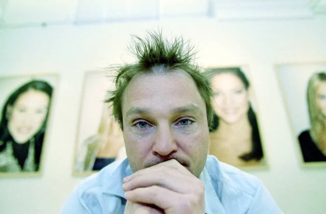
In the right scene, central composition makes for a very powerful statement. A figure standing at the end of a long corridor, a symmetrical facade with a door in the middle or a portrait looking straight into the camera gains weight and stillness when centered. The goal here is to keep the eye from wandering and put the viewer face to face with the subject.
For central placement to work, the surrounding elements also need to be orderly. Distracting lines in the background or a tilted horizon make the frame look unbalanced instead of strengthening the subject in the middle. So in frames where I center the subject, I first clean up the composition, watch the balance between left and right and, if necessary, step back to rebuild the symmetry.
Playing with space and balance
Negative space is one of the least used yet most effective tools of composition. When you place a small figure in one corner of the frame and leave the rest to a misty sea or a blank wall, the image carries a sense of solitude, calm or curiosity. In that case, space isn't decoration; it is the story itself.
| Topic | Tips |
|---|---|
| Highlights | composition, light, street photography |
| Reading time | 6 minutes |
| Written by | Emily Carter |
Key takeaways
- The rule of thirds is a good starting framework, but it doesn't suit every scene.
- In symmetrical scenes, central placement creates a strong, quiet effect.
- Empty space in the frame can be used as a deliberate part of the story.
Balance doesn't always mean symmetry. A large, light-colored object can balance the frame by sitting opposite a small, dark one. Before taking a photo, I ask myself: where is the weight in this frame, where does the eye go and where does it rest? The answer often tells me I need to bend the rules on purpose.
What do you think about this post?


2 Comments
Really useful piece, thank you for putting it together.
I had never thought about this side of it. Looking forward to a follow-up.