







Table of contents
A neighborhood café that had served the same corner for twenty years wanted to reach a new generation of customers but was wary of losing its loyal regulars. In the identity refresh our studio took on, we set out to create a simpler, more contemporary visual language while keeping the warmth of the café's hand-lettered sign. The new logo, palette and menu design grew out of long conversations with the owner and short surveys of local residents. In the gallery you can follow the whole process, from sketches to opening day.
What should you keep from the old identity?
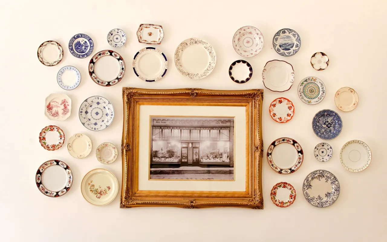
Before starting the refresh, we took an inventory of the old identity together with the café's owner. The hand lettering on the sign, the copper coffee pot on the counter, the thin blue line on the rim of the cups and the old photos on the wall topped the list. When we asked the regulars, the most common answer was “the familiar smell and the hand-lettered sign.” That answer determined which elements had to be kept no matter what.
The biggest risk in an identity refresh is changing the core values while prettifying the surface. We did the opposite: we brought the sign's hand lettering into digital form and simplified it, and reused the thin blue line as a shared signature on cups, menus and paper bags. So even guests who notice the change feel, as they walk in, that they've come to the same place.
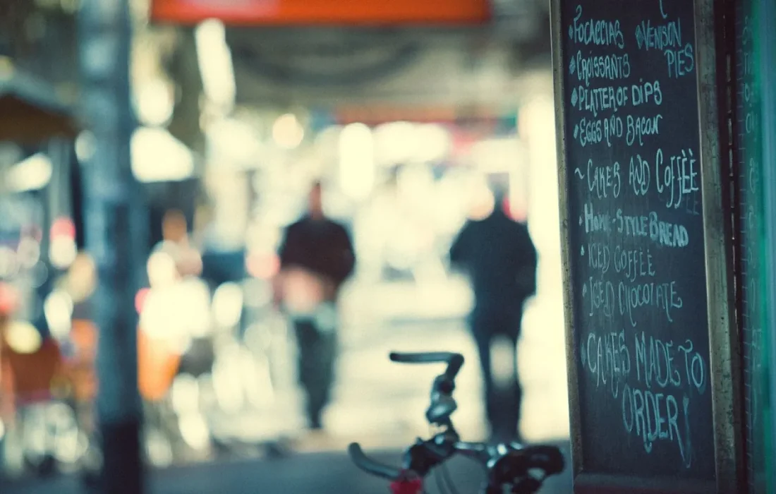
When refreshing a brand, you first have to find what must not change.
Mark Ellison
From the sign to the cup
The rollout meant a long list stretching from the sign to the cup. The sign was repainted, with its contrast increased so it reads better under the lights. The menu became a single-page design printed on thin paper and laid out with hand-lettered headings. A small stamp with the year the café opened was added to the bottom of the cups; that detail turned out to be the surprise customers loved most.
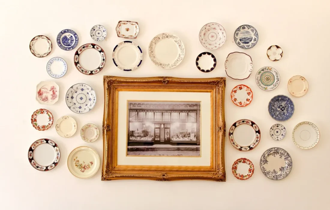

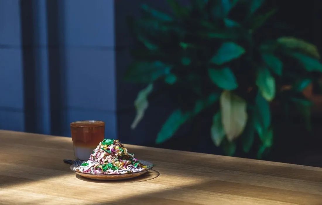
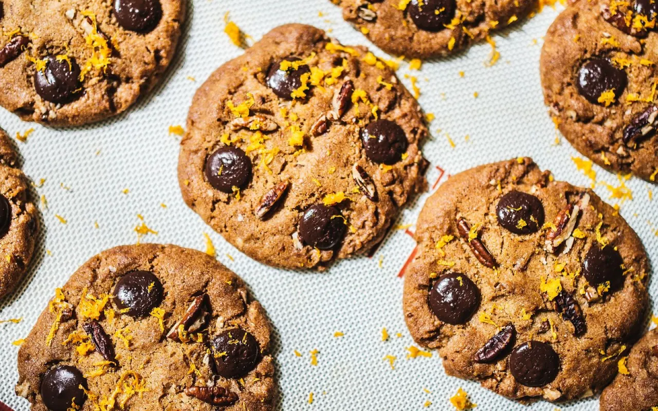
For packaging, paper bags, cup sleeves and cookie boxes were designed to carry the same colors. We also made a simple template for the social media account; photos were taken in the café's natural light, with no filters. All of this work was done in stages on a limited budget by setting priorities, and the café stayed open throughout.
How the regulars reacted
The regulars' reaction was the most exciting part of the project. On opening morning, people lined up at the café door to photograph the old sign one last time. Some squinted as they studied the new menu; others smiled as they looked at their cups. One regular said the place was “even more itself than before”; for our team, that sentence was the most valuable feedback of all. In that moment we felt months of work had paid off.
| Topic | Branding |
|---|---|
| Highlights | logo design, color palette, entrepreneurship |
| Reading time | 6 minutes |
| Written by | Mark Ellison |
Key takeaways
- We first decided what to keep; the hand-lettered sign stayed at the heart of the identity.
- The same blue line became a shared signature on cups, menus and packaging.
- Involving regulars in the process strengthened their sense of ownership.
Of course, not everyone was happy from day one. A few people noticed a detail missing from the old logo and politely said so. We noted those comments and brought back some small details in later print runs. The lesson of an identity refresh is this: rather than keeping customers out of the process, finding a way to involve them gives them a sense of ownership of the brand.
What do you think about this post?
Leave a comment