
Interface design trends for 2026: calm screens, big type and tactile details
Calm interfaces that push back against notification fatigue, bold typefaces and textures that recall real materials are among this year's standout trends. We look at them with examples.
Table of contents
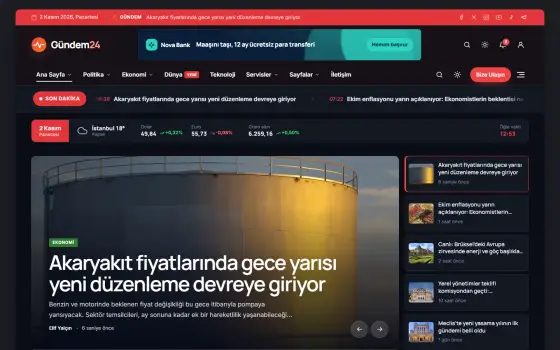
Interface design changes a little every year, but this year's trends reflect an attitude more than an aesthetic. Users worn out by constant notifications and crowded screens are pushing designers toward calmer, less demanding interfaces. Large, characterful typefaces, textures that feel like paper and fabric, and slow, meaningful animations are the standout elements of this approach. We talked with interface designer Melissa Kane about these trends and how they can be applied in projects.
The calm technology approach
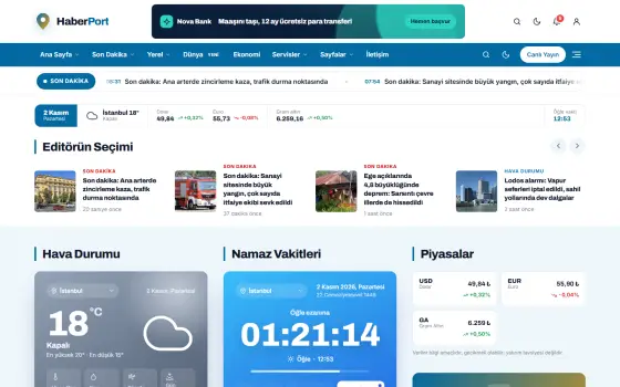
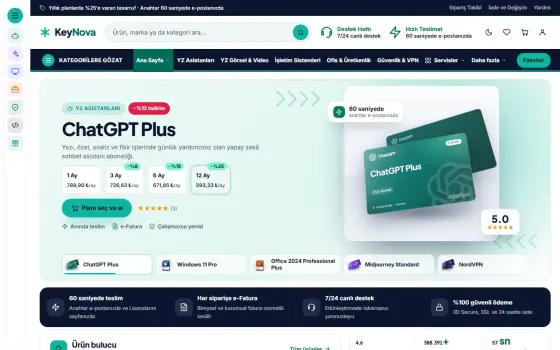
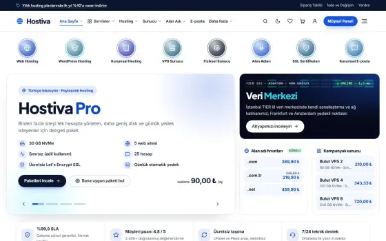
The calm technology approach is a reaction against interfaces constantly demanding something from the user. A new generation of apps groups notifications, shows only the information needed at that moment and doesn't pull users away from their task. White space here isn't waste but a deliberate feature; every element has to truly earn its place.
The practical effects of this trend include single-focus screens, fewer colored badges and quiet modes that kick in when the user wants them. According to Melissa Kane, a good calm interface is one that never makes users feel it's doing nothing, yet is exactly where it needs to be when needed. To achieve this, designers have to decide openly as a team which information is truly urgent.
A good interface doesn't steal the user's attention; it makes room for it.
Sophie Laurent
Typography that fills the screen
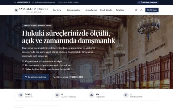
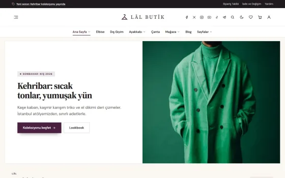
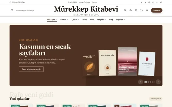
Typography that fills the screen is this year's most eye-catching trend. Big, characterful headlines mean the letters themselves become the hero instead of images. Variable typefaces let weight and width be fine-tuned to screen size and to the user. A headline taking up half a screen is now seen not as a bold move but as a reassuring one.
But big typography also brings responsibility for legibility and hierarchy. Contrast and white space must be balanced carefully so body text doesn't fade next to a very heavy, very large headline. Checking line breaks on mobile, keeping long words from overflowing and testing different language versions in advance are essential details for teams applying this trend.
Tactile feelings in digital
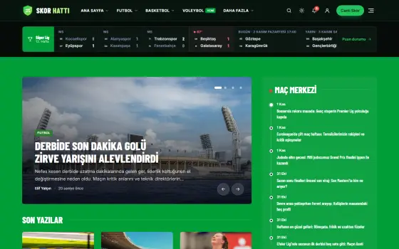
Tactile feelings in digital is another trend that tries to soften the glass surface of screens. Light paper grain, fabric-like textures, soft shadows and buttons inspired by real objects add weight and warmth to an interface. Overdone, these textures look artificial, but used with restraint they create a calming connection with the user. That's why teams first try a texture on a single component, measure the response and only then roll it out.
| Topic | Design |
|---|---|
| Highlights | typography, color palette, minimalism |
| Reading time | 8 minutes |
| Written by | Sophie Laurent |
Key takeaways
- Calm interfaces don't constantly demand the user's attention.
- Big typography requires careful control of contrast and line breaks.
- Texture and animation should stay only when they carry information.
In interactions, slow and meaningful animations are coming to the fore as well. A slight haptic feel when a button is pressed, or a soft transition like turning a sheet of paper when a page changes, makes the experience feel fluid. Kane's rule of thumb is this: if an animation conveys information it should stay; if it's only for show it should go. Supporting the reduce motion option in accessibility settings is a basic requirement too.
What do you think about this post?

Leave a comment